While this particular maze never made my list of abandoned mazes or mazes in need of improvement, in the time between making this maze and posting it on the site I decided to try to improve it. So, now it becomes my 6th case study.
If you want to read the previous 5 case studies:
Case Study#1 - How to Improve a Bad Maze - Tiki Totem Maze
Case Study#2 - How to Improve a Bad Maze - Danzante Conchero Chichimeca Maze
Case Study#3 - How to Improve a Bad Maze - Red Rocks Amphitheatre Maze
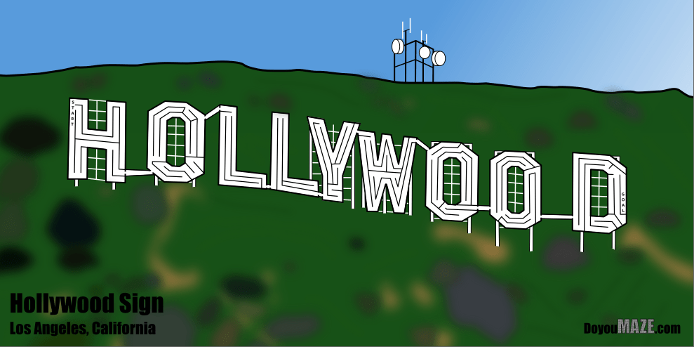
Case Study#4 - How to Improve a Bad Maze - The Hollywood Sign
Case Study #5 - How to Improve a Bad Maze - Severance Hall
You might notice that this blog post title dropped the “bad” maze, because in my opinion the original incarnation of the maze was not bad, just less than what it could be.
Let’s look at that maze, also known as the ‘before’. Now, I want to mention that no matter what size screen you are on it will probably not be large enough. I went max detail on this maze and it is meant to be movie poster size. I like how it looks, but it is a bit bland. Can I improve it?

Here are the enhancements I made to improve and finish the maze:
1. Resize - Any re-sizing will help the maze be seen and improve the look on a screen or when printed. Got rid of a lot of the empty space on top and bottom of the maze.
2. Grass added - I added the setting of the building (no more floating !).
3. Sky added - If you add the ground you should add the sky too!
4. Changed the grout and stone colors - The color of the ruins is what you would see if you were standing in front of them. The grout switches from black to light grey and really changes the look.
5. Change arrow colors - The black arrows no longer look good on the grass colored background so I matched them to the new maze color and that meant I should make sure the…..
6. Letter and branding changed - Re-color to match the ruins and look better against the new background.
FINAL THOUGHTS
And now the “After”. Much better maze. Still difficult to see all the detail without printing it out.

I think this is an improvement. What do you think ?