Book Review - Murder in the Corn Maze

Murder in the Corn Maze (2019) AMZN

from Kensington Cozies, 290 Pages (Granny Reid Mystery Book 2)

by G. A. McKevett (Author)
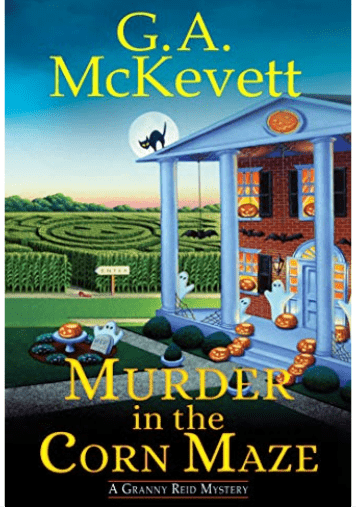
Murder in the Corn Maze book cover

You may know author G. A. McKevett from their book series SAVANNAH REID MYSTERIES. This particular book is book 2 of the GRANNY REID MYSTERIES series, that tells about the popular grandmother figure from Savannah’s books.

In the small town of McGill, Georgia, Stella Reid and her seven grandchildren are enjoying a Halloween corn maze when Savannah stumbles upon a human skull. The skull is later identified as that of Rebecca Dingle, a woman who went missing decades earlier. Stella and Savannah team up to solve the cold case, and their investigation leads them to uncover long-buried secrets about Stella's family and the town's history.

Along the way, Stella and Savannah learn about the importance of friendship, family, and forgiveness. They also discover that even the most seemingly innocent places can harbor dark secrets.

Murder in the Corn Maze is a heartwarming and suspenseful mystery that will keep readers guessing until the very end. It is a perfect book for fans of cozy mysteries and Southern Gothic fiction.

Here are the main themes of the book:

  • The importance of friendship, family, and forgiveness.

  • The dangers of secrets and the power of truth.

  • The importance of never giving up on a mystery, no matter how old it is.
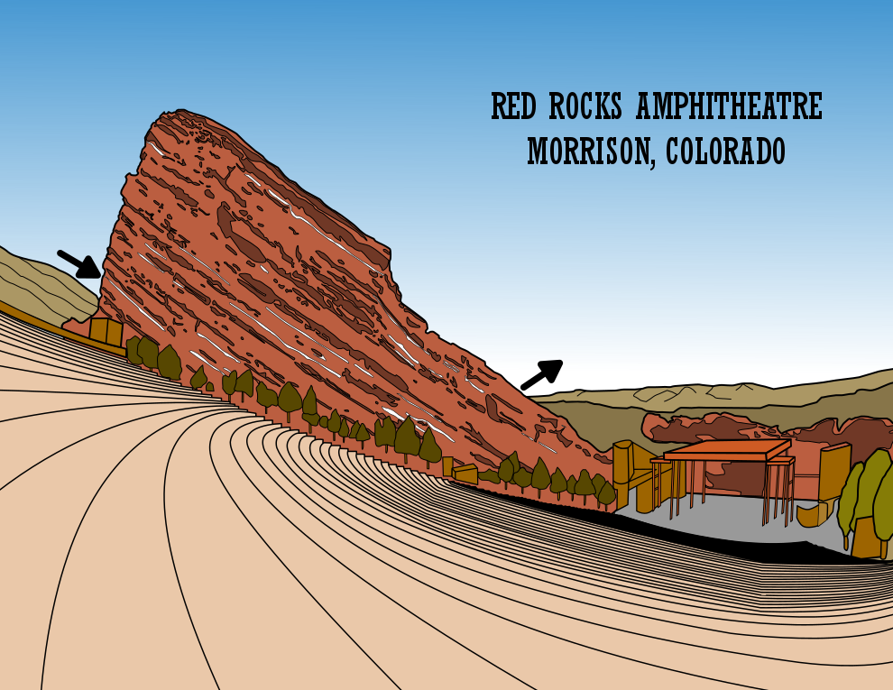
Case Study#3 - How to Improve a Bad Maze - Red Rocks

I took the time to evaluate mazes and see why they did not work and try to determine - could they be salvaged ? Today I present my 3rd case study for improving one of those mazes, Red Rocks Amphitheatre. If you want to read the previous 3 case studies:

Case Study#1 - How to Improve a Bad Maze - Tiki Totem Maze

Case Study#2 - How to Improve a Bad Maze - Danzante Conchero Chichimeca Maze

Back to this maze. Here is what I wrote about the maze in a previous post on why it was abandoned:

“Abandoned Maze #5 - Red Rocks Amphitheatre Maze

Never completed. I never made the maze…just the picture which I struggled with in terms of coloration - every photo of RR has different lighting so the colors are difficult. And most of all, the maze was going to be placed in the rocks but that is a bad structure to make a maze in. Mistake made: Poor subject matter for a maze”

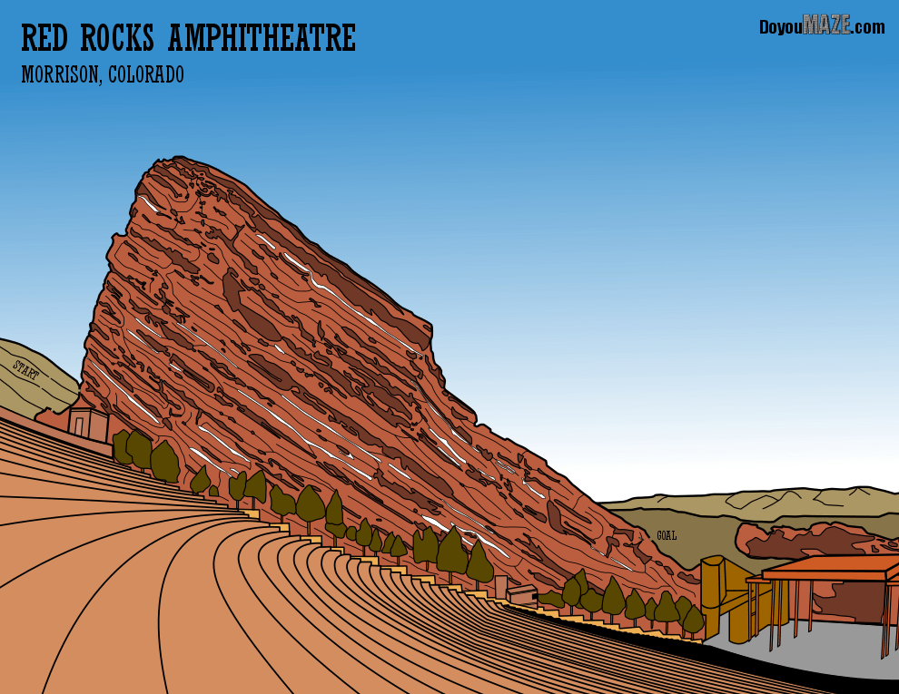
And let’s look at that maze, also known as the ‘before’. Notice there is no maze yet.

Now here are the changes I made to (hopefully) improve the maze:

1. Color - I changed some colors to be less cartoonish. Tree trunks brown from a mustard color (even if you can’t see them). Buildings that were mustard toned to browns. Seating area from a pink tone to more of a brownish tone.

2. Layering Fixed - This is somewhat minor, but there was a layering problem under the trees where the seating ends. In this area there are small concrete or stone shelves between the seating and the rockface. I fixed this issue to expose them as intended.

3. Seating changed - I changed the searing area to include more accurate seats vs. walking area.

4. Start and Finish change - The arrows are a distraction from the picture. It says this is a maze clearly but I changed this to an internal START and GOAL that is less distracting.

5. Maze addition - I went with freehand drawn internal walls within the exposed rockface. I did not want straight lines in the rockface.

6. Zoom Change - Now that the maze was on the rockface and that was the focus I zoomed in to feature that, losing some of the previous details in the stage area. I had thought it was important to show the entire stage but now I disagree with old me.

7. Letter and branding changes - Changed the sizing of the name of the maze and it’s location (floating int he sky before was terrible) and added my branding to the top right corner.

I also did some minor clean up of details in the maze.

FINAL THOUGHTS

Better. I considered changing every tree but decided against it. I think the zoom in and the color changes made a big difference.

And now the “After”. The new maze:

Red Rocks Amphitheatre Maze

I think this is an improvement. What do you think ?

Case Study#2 - How to Improve a Bad Maze - Danzante Conchero Chichimeca

Today I present my 2nd case study for improving a maze I had abandonded, El Danzante Conchero Chichimeca. If you want to read the previous case study:

Case Study #1 - How to Improve a Bad Maze - Tiki Totem Maze

Back to this maze. Here is what I wrote about the maze in a previous post on why it was abandoned:

“Abandoned Maze #6 - Dancing Man Statue Maze

I had high hopes (sing it!) for this when I started it. As you can see I made the figure and I was starting to add muscle definition (in red) when I came to the conclusion - there is no place for a maze - or if there is it will make the maze very large in order to be able to see/solve it. I want this to work because the figure took so long to make and I included so many details. Mistake made: Poor subject matter for a maze. ”

And let’s look at that maze, also known as the ‘before’, which I will note, because of the shape of the statue never got mazed !

And here are the changes I made to (hopefully) improve the maze:

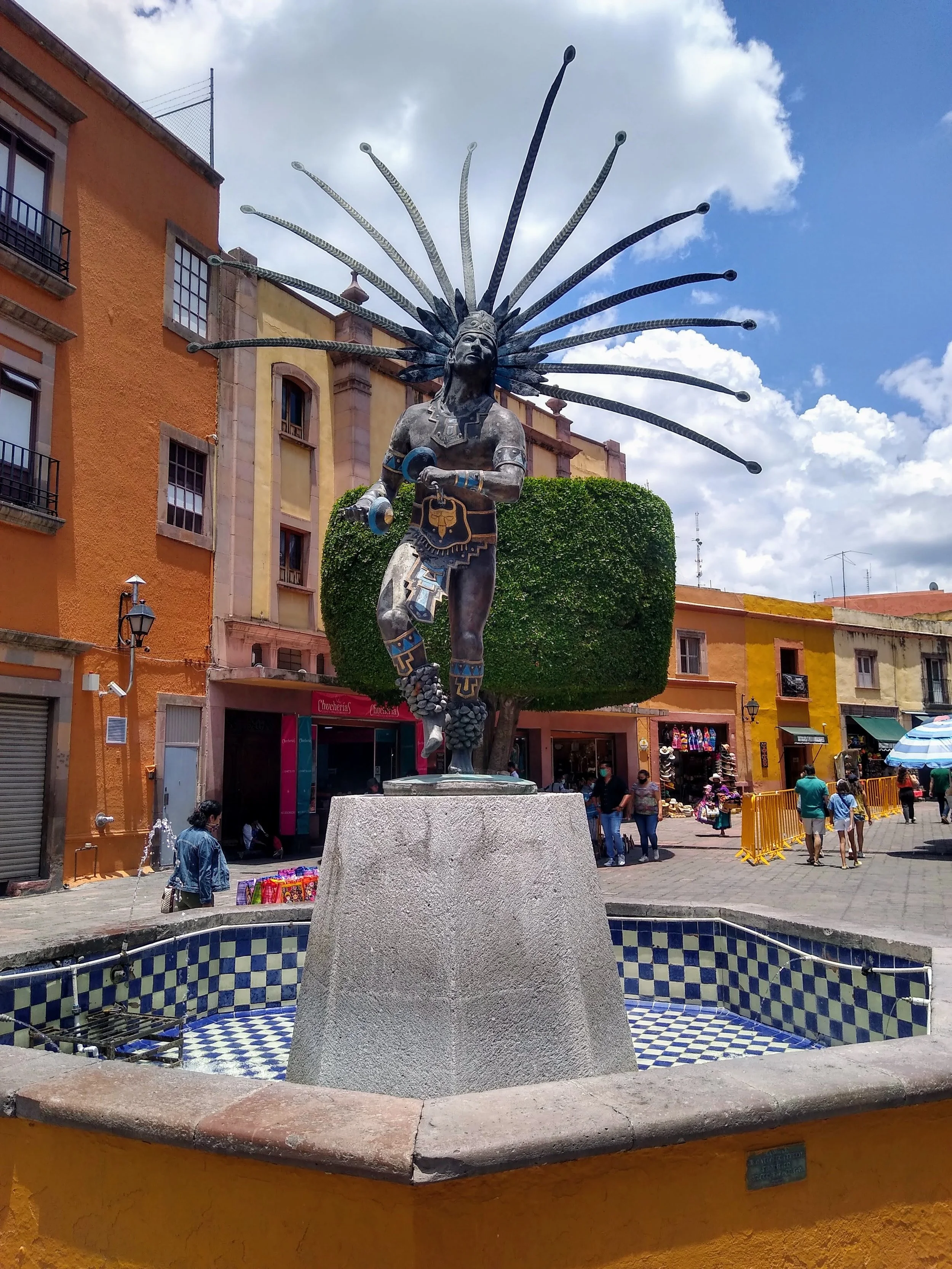
1. Color - I added color to the monument. (It is of a statue in the center of a fountain). The feathers surrounding the head are colored for celebrations although it fades over time but I added blue/white gradient to get that right. I changed the muscular definition from red to grey.

2. Fountain added - The statue had a strong foundation (literally) but I wanted to add the fountain it was in to give it more context and add the wonderful coloring of the tiles.

3. Maze addition - This is where I was stuck before. If I make a maze through the body I hit many roadblocks along the way from all the wonderful dress of the dancer. So, I decided to use the fountain grid for the maze and see if I liked it. I did. Not ideal, but it solved the problem. I did need to add ‘layers’ to the concrete base of the statue that are not really there I felt a long gap in the maze didn’t feel tight.

4. Letter and brand - Add the name of the maze and add my branding to the top right corner.

I also did some minor clean up of details in the maze.

FINAL THOUGHTS

I wanted to add the maze to the body but never figured out a good way to do it. I think the work around using the fountain is ok. I considered but did not do the background buildings/sky. I felt the pose of the statue looking upward should be the focus.

And now the “After”. The new maze:

Danzante Conchero Chichimeca Maze

I think this is an improvement. What do you think ? Should I have added the background buildings ? Should I lighten the statue color ?

April 2025 UPDATE:

I struggle making only 1 change. I went back and switched the Start and Goal to Spanish which makes more sense. I also updated the pathway widths in the fountain by doubling their size making it easier to complete. I thought I would try something different with this maze also. Basically I walked to the statue and took a photo so I could give a mixed media option for the maze. I went with a faded photo to help keep the focus on the maze. Which do you prefer, the mixed media or the blank background version ? I prefer this new, new version in Spanish and with the new background:

Laberinto del Danzante Conchero Chichimeca photo background 2025

Here is a photo from a slightly different angle to show you what this looks like in real life:

Danzante Conchero Chichimeca, en QRO, Mexico

Seems like I could improve this again with better lighting and shadows…but I think I will leave it as is.

Case Study #1 - How to Improve a Bad Maze

Today I present a case study for improving one of my abandoned mazes, the Tiki Totem Maze which ended up becoming Maze of the Week #86. Here is my analysis from a previous blog:

“Abandoned Maze #4 - Tiki Totem Maze

I thought this would be a good idea. Tiki totems are so cool. I can’t quite put my finger on this. It just isn’t good enough to be on the site as a weekly featured maze. I think it MIGHT be able to be fixed. Add color to the totem, and to make it more interesting - SHADOWS. I would also try a more complex maze structure vs the current kids level format. But I can’t be sure that will be enough…so it will not get done ….or it will. We’ll see. Mistake made: Not enough details / interest”

And I must say, for a maze to be recoverable, the mistake made of not enough details/interest is a giveaway that the maze is salvageable with some additional work. Now let’s look at that original maze, also known as the ‘before’:

Hawaii Tiki Totem simple Maze

And here are the changes I made to (hopefully) improve the maze:

1. Color - The actual tiki is not black and white (nor does it have brown accents as the initial maze pathways imply. I went with the weathered grey color of the tiki. I switched the color of the walls to a complementary charcoal color.

2. Shadows added - It is a tiki on a beach so it is in the sun. I went with lots of shadows ! This really shows the shape of the tiki better, especially the eye area. I took the extra time to shadow the nose, neck, and under the pecs.

3. Maze placement - The tiki is full length and sits in the sand on a beach, but I only made the top portion. It is also surrounded by a sea of white nothingness. After considering adding the full totem, I instead decided to place the totem against the bottom of the page which allowed for….

4. Beach scene added - By moving the totem forward there is a large background to fill. That was a perfect place to add a background that included a beach, a palm tree and the sky. I spent 70% of the time improving this maze working on the leaves of the tree, then used a gradient color to accurately color the trunk. I did my best to add foam to the break of the water at the shore.

5. Start and Goal changed - The placement also meant a change from arrows to an internal Start and Goal using lettering.

6. Sky addition - The white sky felt like empty space. Might as well finish the color. I went cloudless like a great day at the beach (with sunscreen).

7. Lettering and branding - Add the name of the maze and my branding both of which were previously missing.

Also considered but not updated:

I decided to not change the actual maze beyond minor moves. It remains easy for kids but looks a lot better for everyone; Something on the water like a boat or a shark fin, or the sky like the sun or some birds; The full totem poll (as mentioned above).

And now the “After”. The new maze:

Hawaii Tiki Totem Maze

I think this is an improvement. What do you think ? Should I have added more details ?

This is how the Tiki Totem became Maze of the Week #86 after sitting on the shelf for over 2 years ! Maze download is available !