This is a continuation of my maze design experiments. Read about it in post #1, One Maze - Many designs, and so on with a new post every Friday.
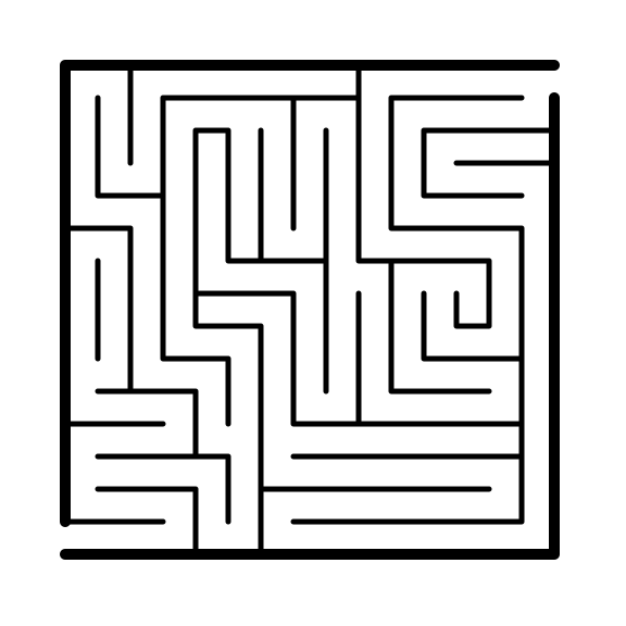
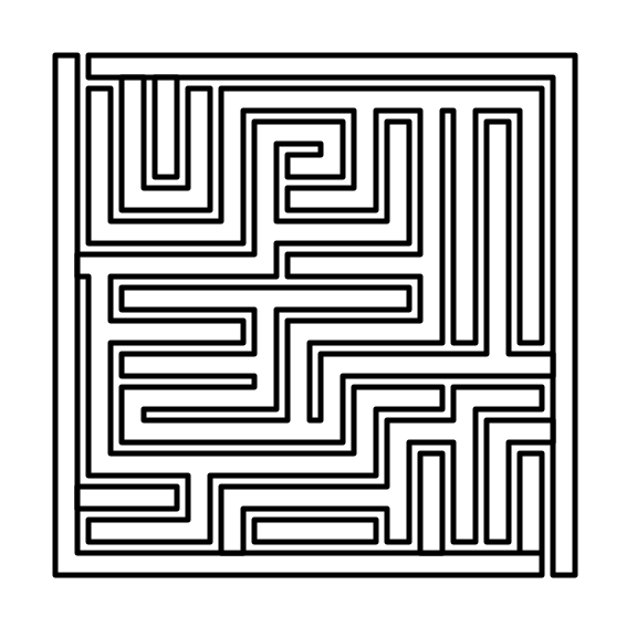
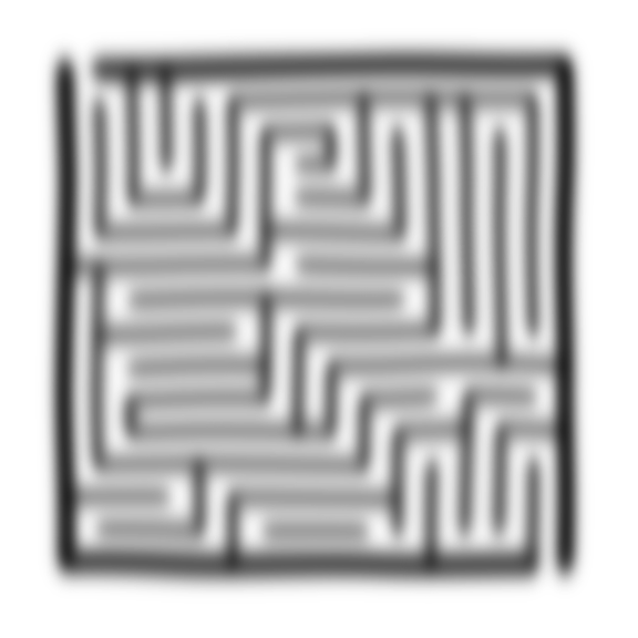
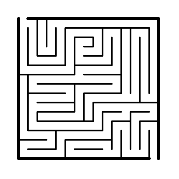
The original maze:
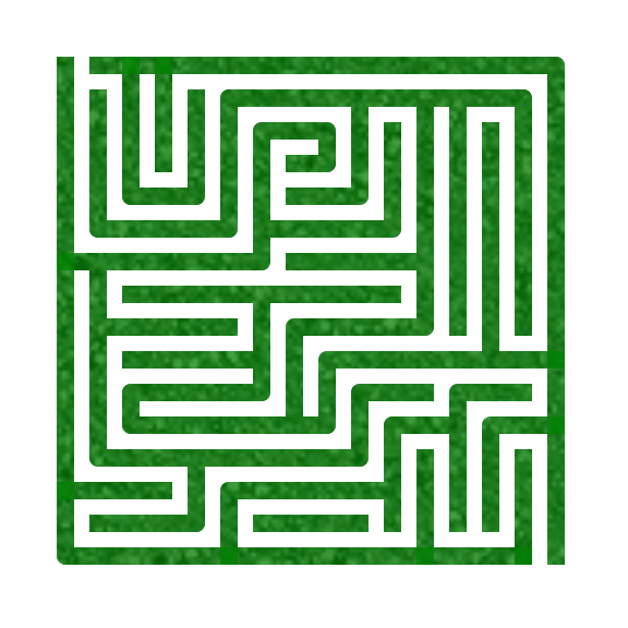
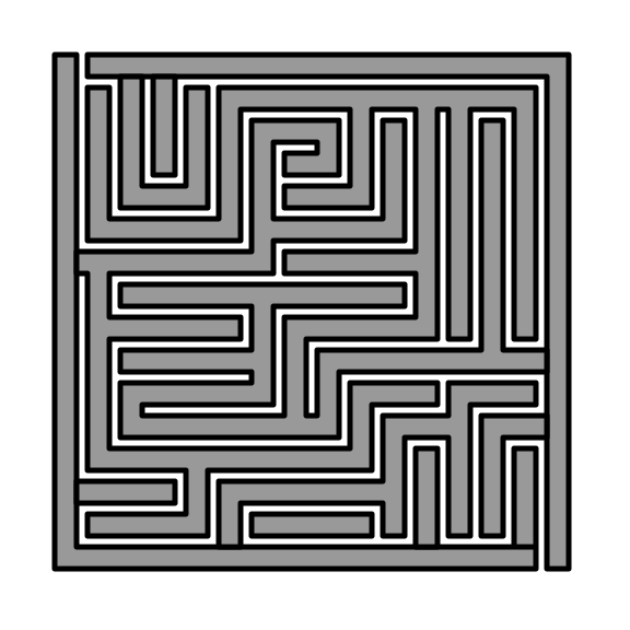
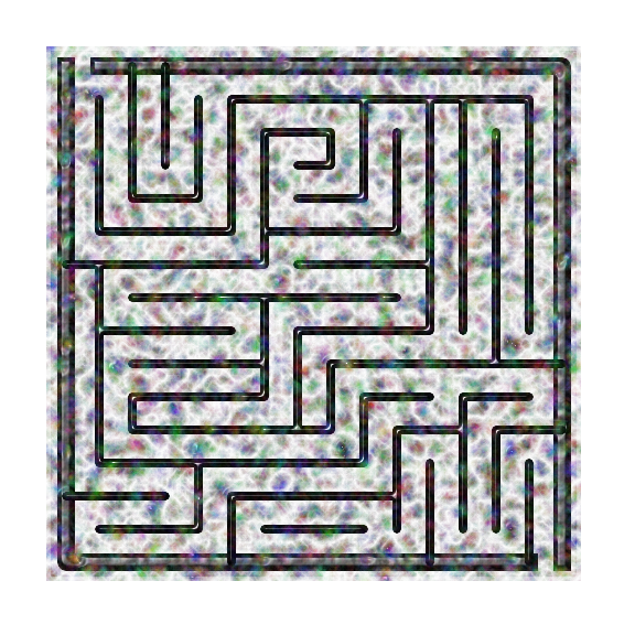
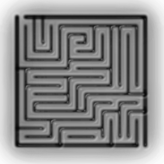
I saw that Bing Image creator had some new pre-set image creators so I tried them again to see how or if it improved. For each generation I uploaded the original maze.
For the first maze I asked Bing to create a fun background. It went with a beachball, star, rainbow, cloud, flowers, leaves, and a birthday cap. Unfortunately it de-mazed the maze.
The second maze used the Impressionist button, but it de-mazed the maze again.
The third maze used the item Spotlight button, but it de-mazed the maze.
The fourth maze used the Oil Painting button, but it de-mazed the maze.
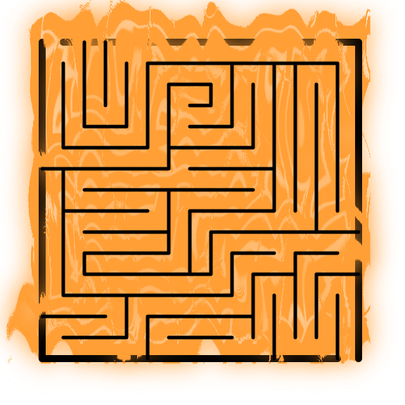
The fifth maze I asked Bing for an Americana background and not to touch the maze….but it de-mazed the maze (again).
Bing really can’t make a background without touching the foreground. It loves to de-maze, mazes. Bing could make a background for mazes, but not with the foreground maze in the equation, leave it out and add it later yourself ! AI is still having problems with this !