I took the time to evaluate mazes and see why they did not work and try to determine - could they be salvaged ? Today I present my 4th case study for improving one of those mazes, The Hollywood Sign. If you want to read the previous 3 case studies:
Case Study#1 - How to Improve a Bad Maze - Tiki Totem Maze
Case Study#2 - How to Improve a Bad Maze - Danzante Conchero Chichimeca Maze
Case Study#3 - How to Improve a Bad Maze - Red Rocks Amphitheatre Maze
Back to this maze. Here is what I wrote about the maze in a previous post on why it was abandoned:
“Abandoned Maze #1 - The Hollywood Sign Maze
Technically could be considered a finished maze. But it is very boring. Not particularly good. It does not bring a Kondo level of joy. The maze is easy. Could it be salvaged ? Yes, probably with some color and lots of background detail - but once you see a photo of the actual sign and it’s surroundings you notice a lot of rocks/dirt and just a few bushes. The top of the hill has fences, and cellphone towers, etc. So, this COULD be salvaged, but most likely won’t be. Mistake made: Poor subject matter / poor execution
And let’s look at that maze, also known as the ‘before’. SOOOO boring.

This was a tough one. I rated the above maze a 2 out of 10. Here are the changes I made to (hopefully) improve the maze:
1. Color added - The Hollywood letters in white should pop against the background of the hill. So I colored the hill to enable the bright white letters to pop. I did 2 versions of the hill, bright green and a more normal brownish green we need rain color.
2. Tower added - I added a tower to the top of the hill. One of many possible but enough to show what is there. I did not add the fence since most people never notice it.
3. Bushes added - The slope of the hill has many different types of bushes in various shades of green/brown and grey. I added them around the hillside. I also added some outlines of ridges and some dirt trails.
4. Blur - Although when I saved the file as a png it does not save (so I use screenshots instead), I made everything on the hill that is not a letter blurry. The hillside in pictures does not have a lot of definition or detail that is important - it is just there so highlight the sign, so the blurring helps this (I hope).
5. Letter and branding added - Added the name of the maze and added my branding.
6. Sizing Change - Slight change based on how everything looked, I kept the wide shot but gave it a bit more height based on the tower/branding locations. Initial maze was 990 x 360 and is now 990 x 494, so 37% taller.
FINAL THOUGHTS
Better. Maybe this went from a 2 to a 5. A 2 never sees the light of day. A 5 only does if I see a special case for it (like this case study).
And now the “After”. The new maze in 2 colors:
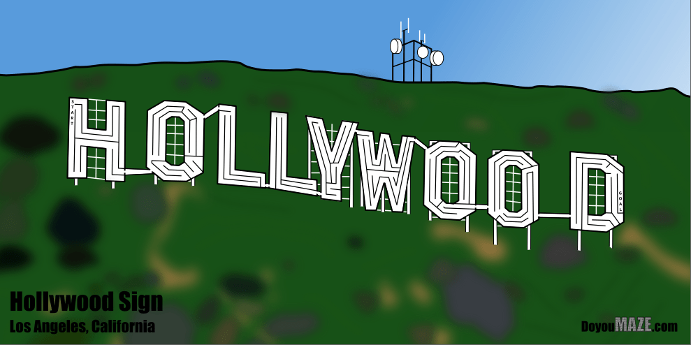

I think this is an improvement. What do you think ? Do you prefer one green over the other ?