Maze of the Week #90 - The Mayan Ruins at Uxmal

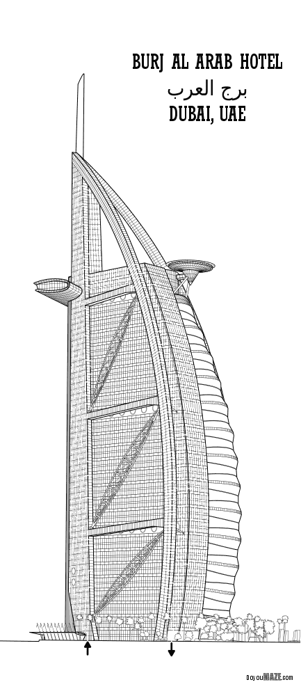
Maze of the Week #90 takes us back to Mexico and my 2nd different maze of a pyramid or ruin with this Mayan Ruins Maze from the Uxmal archeological site in the Yucatán of Mexico. Here are my other similar mazes:

Chichen Itza Maze

Monte Albán Maze

YouTube: Here is a tourist guide to the site with some great scenes !

The Maze: I re-worked this maze after finishing it. I think the improvements improved it a bit; not a drastic change, but definitely better. The maze is large and more difficult than usual, but I held back making it extra difficult. Here is the final maze:

Mayan Ruins at Uxmal Maze

The Mayan Ruins at Uxmal Maze

I hope you enjoy the maze. Maze download is available on the homepage. Check out my YouTube channel where you can watch mazes being made and solved !!! This was my last of 5 straight mazes with case studies - I hope you enjoyed them !

Coming next week:

A maze of more Mexican ruins !

6 Completed Mazes that Deserve a bit of improvement

I have been thinking alot recently about improving my mazes. It started when I found over 20 mazes that I had abandoned for one reason or another. I wrote 2 blog posts about them that you can read here:

Why I abandoned these 10 mazes - Mistakes in Maze making

10 More Abandoned Mazes - Mistakes in Maze Making

But I also knew that a few of these could be salvaged with some work. And that led me to a series of case studies where I evaluated and transformed some of the mazes. I really enjoyed this. I had previously put in work and it was nice to see some of the projects through to completion even if it sometimes meant being creative in my solutions. Today I am doing something similar. These are completed mazes that have been featured as Mazes of the Week previously. I sometimes think I could improve them with some changes. The inspiration came from Maze of the Week #62 that I made of a windmill. When I posted it I thought it was ok…which was not good enough so I made some changes and posted a newer better version the next day.

Initial Maze: ok.

Windmill  maze

Revised Maze: I decided to add some shadows to improve the maze…and resized it because the lawn in front is too large IMO. Then I added a title. I think this really improved it. I hope you agree !

Windmill Maze

Here are 6 mazes I am considering improving in some way. I may never actually do all of them, but this is what I am considering:

  • Museo Soumaya Maze. The simple black and white maze (plus green for the plants) isn’t bad. But colorization would be more accurate. And this building always has interesting shadows on it in photos.

Museo Soumaya Maze
  • Burj Al Arab Hotel Maze. Colorize. Shadowize (is that a word?). You know this building gets a lot of sun ! That means shadows. I always get a good reaction to this maze and know I could improve it.

Burj Al Arab Hotel Maze
  • Soldiers and Sailors Memorial Arch Maze. The empty band near the top contains a very intricate scene that I never started/completed. I need to find a high quality picture of it…then take the time to draw it but was not sure it would be worth the effort (50 soldiers plus horses ?). Right now the maze does not go into or above that section.

Soldiers and Sailors Memorial Arch Maze

Photo of the monument:

Soldiers and Sailors Memorial Arch

Billy Wilson - flickr

  • Severance Hall Maze. I already took this from abandoned to MotW status. Now I want to fix the trees, grass and bushes to be more natural. These are flat. I can do better. I have been making better trees and grass recently. So this is an abandoned maze that I revised…and now I want to revise again.

Severance Hall Maze
  • Pro Football Hall of Fame Maze - Colorize. Shadowize.

Pro Football HOF black and white maze
  • The Gherkin Maze - The structure of the windows means this could have a really cool hidden solution if I wanted it to. But what should it be ? I already have 2 versions, color and black and white. Do I need a third ?

The Gherkin blk and white maze

So those are the 6 mazes that I look at and wonder if I should take the time to improve them. I’m sure a few of them will be done when I have time. If you have a maze you would like to see improved drop me a note !

Case Study#5 - How to Improve a Bad Maze - Severance Hall

I have written 2 blog posts featuring a total of 20 mazes that I abandoned for one reason or another. You can read them here:

Why I abandoned these 10 mazes - Mistakes in Maze making

10 More Abandoned Mazes - Mistakes in Maze Making

I took the time to evaluate the mazes and see why they did not work and try to determine - could they be salvaged ? Today I present my 6th case study for improving one of those mazes, Severance Hall. You may recognize this maze. It was featured as Maze of the Week #79 in July. I realized I should have done a post showing the transformation previously. If you want to read the previous 5 case studies:

Case Study#1 - How to Improve a Bad Maze - Tiki Totem Maze

Case Study#2 - How to Improve a Bad Maze - Danzante Conchero Chichimeca Maze

Case Study#3 - How to Improve a Bad Maze - Red Rocks Amphitheatre Maze

Case Study#4 - How to Improve a Bad Maze - The Hollywood Sign

Here is what I wrote about the maze in the previous post on why it was abandoned:

“Abandoned Maze #3 - Severance Hall Maze

This almost maze was done before I started using perspective for just about every maze, that’s why it looks so boxy. I was in-between wanting to start from scratch or moving forward with the maze. I never made a decision and it got lost until I found it for this post. It also appears to be floating and a nondescript building. Mistake made: Using a poor method to start with. Indecision on how to move forward.”

And let’s look at that maze, also known as the ‘before’. There was no color, no maze, and it was very boxy, with the building floating on the page.

Severance Hall drawing

Here are the enhancements I made to improve and finish the maze:

1. Color added - I added color throughout the maze. I did some minor shadowing in the front of the building behind the columns. Changed the color of the window frames from black to grey to better reflect actual building.

2. Trees, bushes and grass added - I added the setting of the building (no more floating !). That meant large trees on each side of the building and a long row of bushes in front with a lawn. There is also a small pathway on the right side.

3. Sky and clouds added - I usually avoid clouds but this is Cleveland and clouds are a fact of life.

4. Added some details - The spotlight on the right side was previously missing. The year on the building “MCMXXX”. Added the name to the building.

5. Added bricks and the maze - Key to actually making this into a maze. The bricks enabled me to add the maze as their structure was used for the walls of the pathways. There are also some larger sections of concrete on the sides. Overall this changed the look of the building a lot. For the Start and Gal I went with internal but made them blue to make them a bit easier to find.

6. Letter and branding added - Added the name of the maze and added my branding in the corner.

FINAL THOUGHTS

I could have spent more time on the trees and bushes, but I think this is ok from what I started with. I think it represents the building well.

And now the “After”.

Severance Hall Mazed

I think this is an improvement. What do you think ?

Case Study#4 - How to Improve a Bad Maze - Hollywood

I have written 2 blog posts featuring a total of 20 mazes that I abandoned for one reason or another. You can read them here:

Why I abandoned these 10 mazes - Mistakes in Maze making

10 More Abandoned Mazes - Mistakes in Maze Making

I took the time to evaluate the mazes and see why they did not work and try to determine - could they be salvaged ? Today I present my 4th case study for improving one of those mazes, The Hollywood Sign. If you want to read the previous 3 case studies:

Case Study#1 - How to Improve a Bad Maze - Tiki Totem Maze

Case Study#2 - How to Improve a Bad Maze - Danzante Conchero Chichimeca Maze

Case Study#3 - How to Improve a Bad Maze - Red Rocks Amphitheatre Maze

Back to this maze. Here is what I wrote about the maze in the previous post on why it was abandoned:

“Abandoned Maze #1 - The Hollywood Sign Maze

Technically could be considered a finished maze. But it is very boring. Not particularly good. It does not bring a Kondo level of joy. The maze is easy. Could it be salvaged ? Yes, probably with some color and lots of background detail - but once you see a photo of the actual sign and it’s surroundings you notice a lot of rocks/dirt and just a few bushes. The top of the hill has fences, and cellphone towers, etc. So, this COULD be salvaged, but most likely won’t be. Mistake made: Poor subject matter / poor execution

And let’s look at that maze, also known as the ‘before’. SOOOO boring.

Hollywood Sign drawing

This was a tough one. I rated the above maze a 2 out of 10. Here are the changes I made to (hopefully) improve the maze:

1. Color added - The Hollywood letters in white should pop against the background of the hill. So I colored the hill to enable the bright white letters to pop. I did 2 versions of the hill, bright green and a more normal brownish green we need rain color.

2. Tower added - I added a tower to the top of the hill. One of many possible but enough to show what is there. I did not add the fence since most people never notice it.

3. Bushes added - The slope of the hill has many different types of bushes in various shades of green/brown and grey. I added them around the hillside. I also added some outlines of ridges and some dirt trails.

4. Blur - Although when I saved the file as a png it does not save (so I use screenshots instead), I made everything on the hill that is not a letter blurry. The hillside in pictures does not have a lot of definition or detail that is important - it is just there so highlight the sign, so the blurring helps this (I hope).

5. Letter and branding added - Added the name of the maze and added my branding.

6. Sizing Change - Slight change based on how everything looked, I kept the wide shot but gave it a bit more height based on the tower/branding locations. Initial maze was 990 x 360 and is now 990 x 494, so 37% taller.

FINAL THOUGHTS

Better. Maybe this went from a 2 to a 5. A 2 never sees the light of day. A 5 only does if I see a special case for it (like this case study).

And now the “After”. The new maze in 2 colors:

Hollywood Sign Maze
Hollywood Sign Maze alternative color

I think this is an improvement. What do you think ? Do you prefer one green over the other ?