If you are interested in maze design you have come to the right place. I have a series of case studies where I take mazes and try to improve them. Today I want to focus on a specific aspect that I think is rare for maze makers to use but seems to really improve how a maze looks, Shadows.
This topic has been seen in previous case studies (#1,#8,#9,#10) because once I started using shadows in my mazes, I found it hard to not use them because I think they make mazes look so much more realistic. In fact, when I look at mazes from a few years ago, I want to improve most of them. That is the advantage of being a digital maze artist - I can be like George Lucas with Star Wars and just keep tweaking things I don’t like from the past.
Why Shadows Make Mazes Better
I will be showing 2 options for a variety of my favorite mazes, one without shadows and one with shadows. In every case the shadows make the illustration/maze more interesting, typically by giving it more perceived depth on the page. I have set-up the galleries to transition between the 2 options for easy comparison !
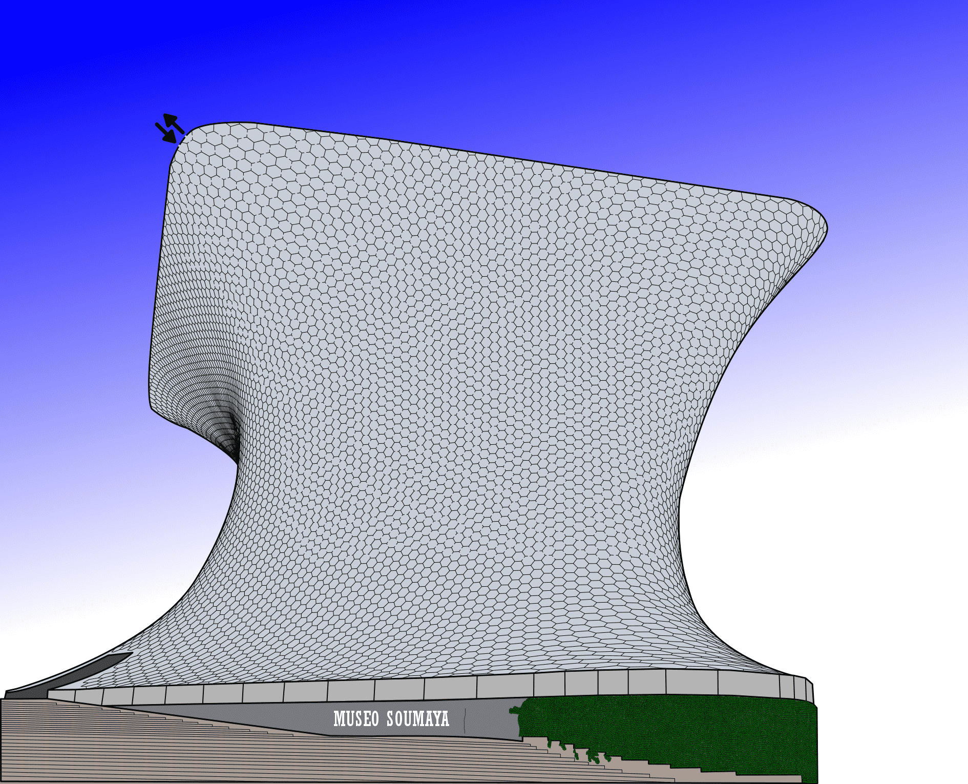
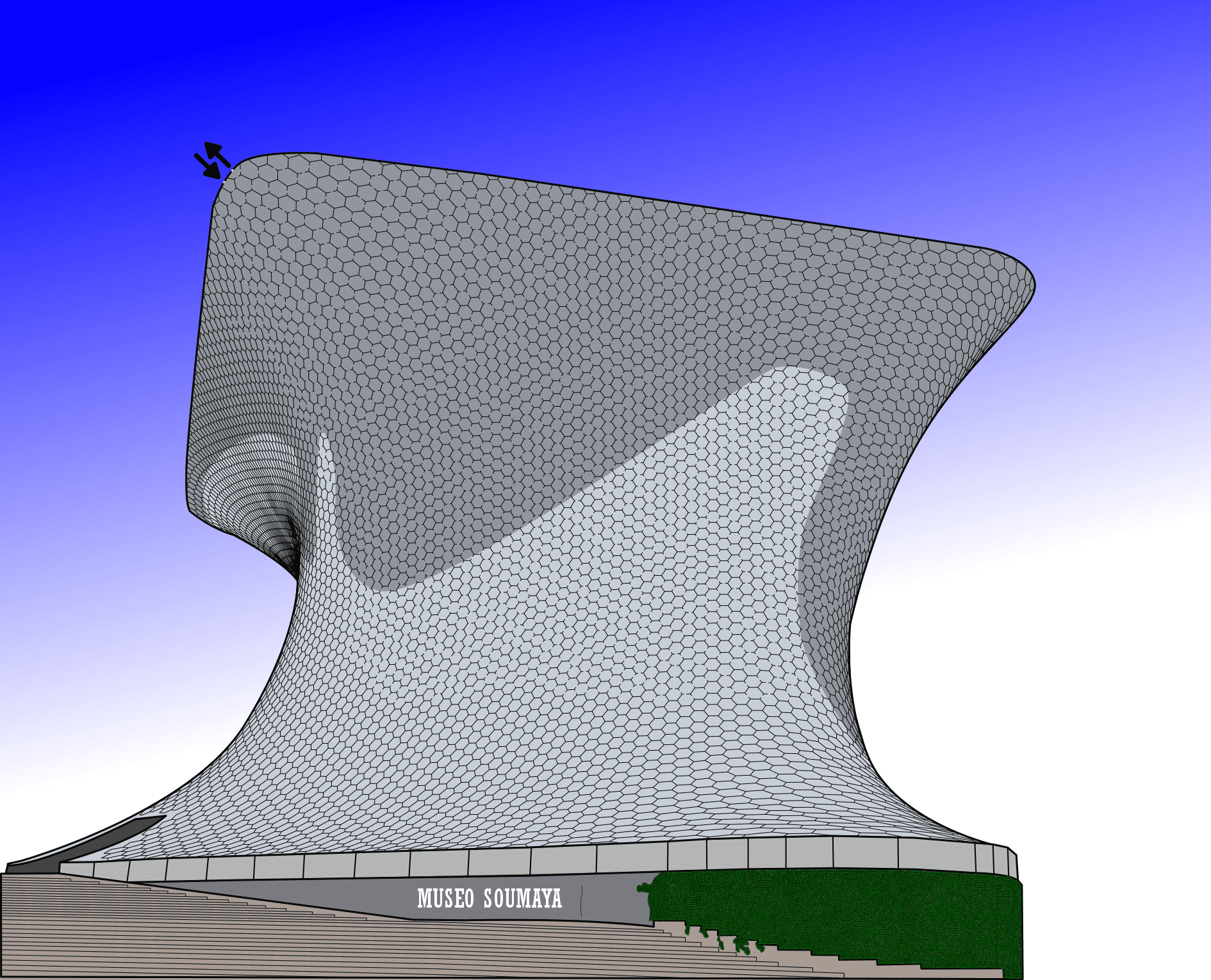
Maze #1 - Museo Soumaya Maze
For this example I had to create a new version previously unseen, in color, but no shadows. The shadows give the building more shape !
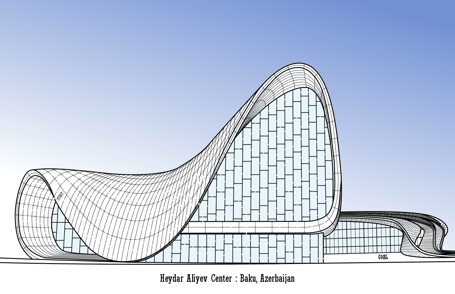
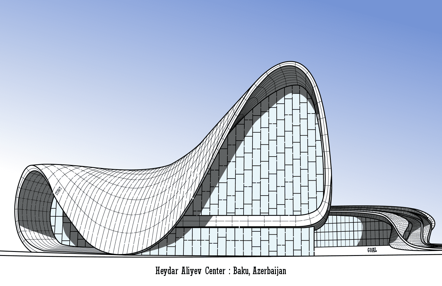
Maze #2 - Heydar Aliyev Center
With such an interesting shape, this is much better with shadows !
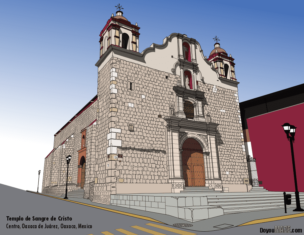
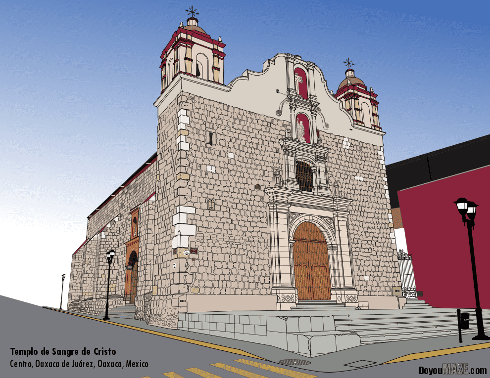
Maze #3 - Templo de Sangre de Cristo Maze
Not as drastic a change as the mazes above, but still an improvement, especially in the nooks of the church.
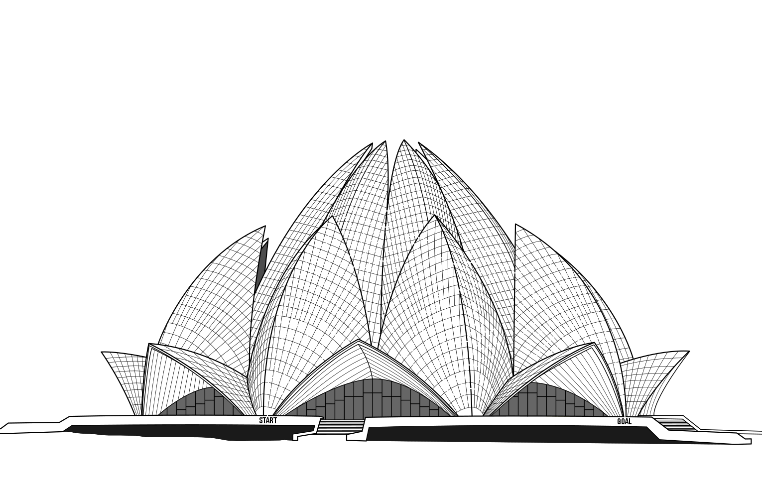
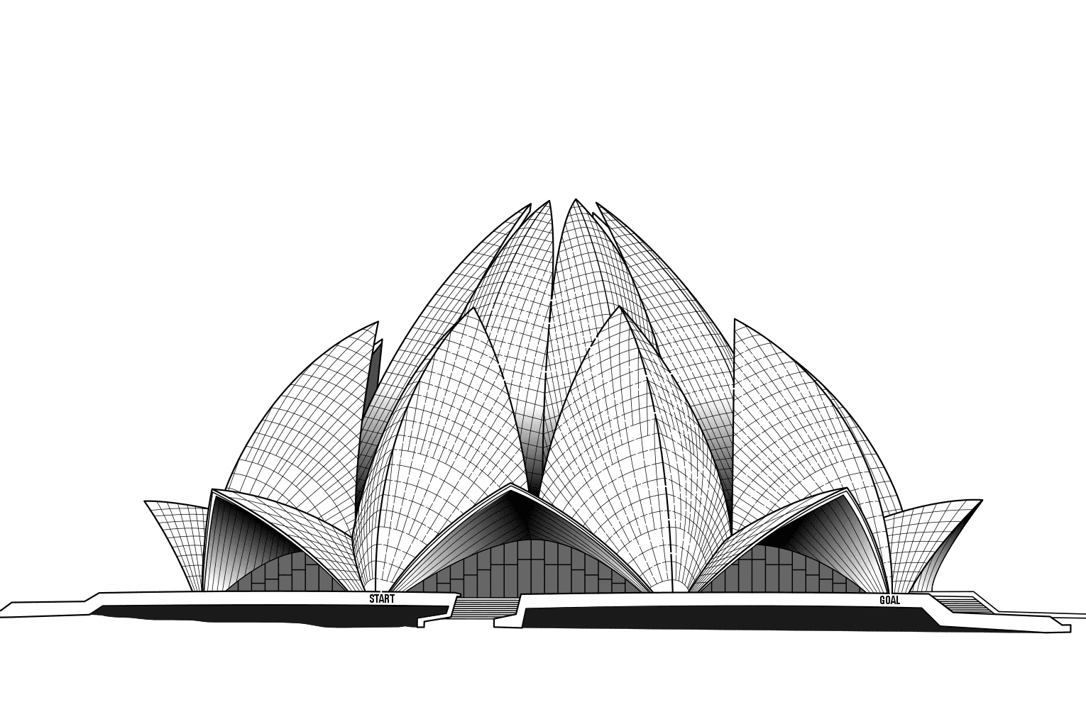
Maze #4 - Lotus Temple Maze
I thought this wonderful building would make a nice maze, but when I finished it it seemed a bit bland. The shadows really help the petals of the building stand out and also show the doorway overhangs better.
There are many more examples of my use of shadows on the site. I encourage you to give it a try.
Here are previous case studies on maze making:
Case Study#1 - How to Improve a Bad Maze - Tiki Totem Maze
Case Study#2 - How to Improve a Bad Maze - Danzante Conchero Chichimeca Maze
Case Study#3 - How to Improve a Bad Maze - Red Rocks Amphitheatre Maze
Case Study#4 - How to Improve a Bad Maze - The Hollywood Sign
Case Study #5 - How to Improve a Bad Maze - Severance Hall
Case Study#6 - How to Improve a Maze - Uxmal
Case Study#7 - How to Improve a Bad Maze - Ship
Case Study#8 - Improving Previous Mazes
Case Study#9 - Improving a Maze - Taj Mahal
Case Study#10 - Improving a Maze - Templo de Sangre de Cristo