How to Make a Mobile Maze

The 43rd type of maze construction I will “how to” is the Mobile Maze. Like some of our other mazes, most notably, the Kids Maze, this type of maze can look many ways and have many different constructions, but it is still has distinct characteristics to properly execute ! Let’s define what a Mobile maze is then get into the step by step instructions !

Mobile Maze - A Maze designed specifically to be viewed and solved on a mobile device.

HOW TO MAKE A MOBILE MAZE

Step 1 - Choose the Maze construction

This seems like an odd Step 1, but it is correct. Similar to a Kids Maze, the Mobile Maze can be created dozens of different ways. Take a look at the How To Draw a Maze section and choose the look you prefer. You will actually be following THOSE sets of instructions while following some basic rules to make the maze look good on mobile ! Also note that some objects lend themselves to this maze construction - a giraffe would be good, as would a anything long.

Step 2 - Follow the instructions + add these rules

Follow the instructions of the maze construction you selected while adding these 2 rules:

  1. Design the maze vertically using a 9:16 ratio or greater. The 9:16 ratio is the standard size for a mobile screen (you can read more about screen sizes below) . An easy way to think of this is that you want a maze about twice as high as the width. If you want a maze to be scrollable in order to be solved (this adds some difficulty !), try for a larger ratio like 1:4. What do I mean by that ? Well in a scrollable maze a dead end may be off the visible screen - in fact you might even design your maze with this in mind to make it more challenging !

9:16 ratio example block

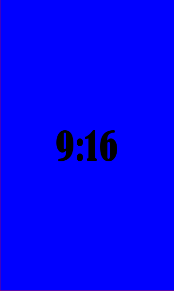
WHAT A 9:16 RATIO LOOKS LIKE

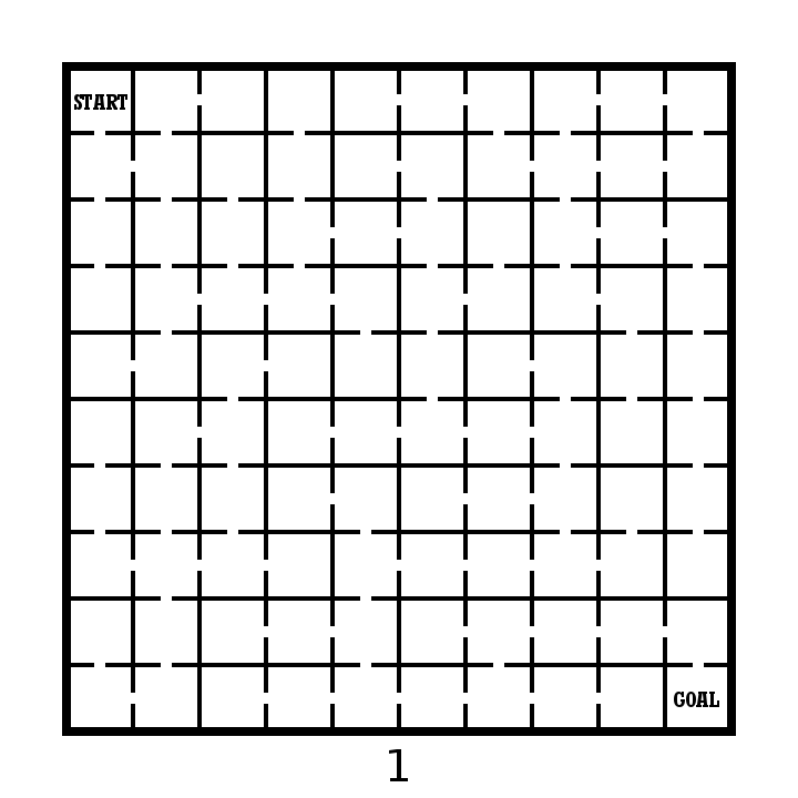
2. Make pathways that are WIDE. This is a vague but important design feature. I find that a bit of testing is needed to get this just right. If you design digitally it can easily be adjusted (and this is for mobile, so I assume that it is) in order to have a maze that can be solved easily. For Grid based mazes (Grid Maze, Color Grid Maze, Arrow Maze, Block Move, etc.) the widest # of blocks I would suggest using is 5.


Let’s look at a few different Mobile Maze examples:

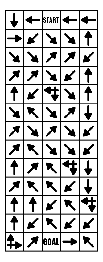
Here is an example of a Mobile Arrow Maze, that is a 5:13 ratio, and because it is an Arrow Maze, no pathway adjustments are needed ! Because the maze is long the solver cannot see the Goal when they start solving it !

Mobile Arrow Maze in a 5:13 ratio

And here is an example of a Mobile Grid Maze. Once again I used a 5:13 ratio. Notice how the pathways between grids are much thicker than usual. I more than doubled the normal width.

Mobile Grid Maze in a 5:13 ratio

A Mobile Weaving Maze. 5:23 ratio, and with very wide pathways. I find that this construction needs more length than others to help establish more realistic false pathways. Still, this is a fun maze to make and solve in a mobile format.

Mobile Weaving Maze in 5:23 ratio

And one more for fun. A Mobile Hidden Message Trail Maze. 5:18.

Mobile Trail Message Maze in 5:18 ratio

ADDITIONAL MOBILE MAZE EXAMPLES:

I have a section on the site of over 30 mobile mazes, that includes a free downloadable file of each of them (not really a book since the sizing is for mobile phones, and not for printing). And, although it does not have many words, if you prefer to read and solve laberintos en Español, tengo que aqui.

MAZE DESIGN BASED ON SCREEN SIZE:

Computer screen monitors vary in their aspect ratio, but most since 2012 are 16:9 (1.78), although through time they have varied from 1.25 to 1.60. So, yes, you are not imagining things, computers are getting wider. Some of you might even remember when televisions were a 4:3 aspect ratio (1.33) before they became much wider.

Most smartphones also happen to be a 16:9 (in landscape mode or 9:16 in portrait mode) which is convenient when you use landscape mode to watch YouTube or other videos on your phone. But when you are not watching videos, your phone is in portrait mode for just about everything else you use it for. Tablets have large range of ratios with many 4:3 like an old tv and some 16:10. This makes them a bit wider so that books get formatted as a priority over videos (you are reading with your tablet and not watching movies right ?).

So, when I make a maze for this website I am always thinking about how it will look on a large screen and how it will print on a standard size piece of paper (8.5x11) which is a 1.29 ratio. The mazes still look fine on a cellphone screen, but are not entirely solvable in most cases without zooming in to see the pathways more clearly. This means a lot more difficulty in maneuvering to solve a maze.

So when you make a maze those are the screens you might be making them for. And in this case, Mobile mazes you want to design for a 9:16 screen !

OTHER POSTS THAT MAY INTEREST YOU:

44 Different types of Mazes and Labyrinths

Comparison of the Top 10 Maze Generation Websites

A Huge Maze of the Sydney Opera House

Maze Design Case Study - Designing a Grid Maze in Different Difficulty levels

I wanted to do a case study showing how to create a maze in a few different difficultly levels. I thought the best way to illustrate this was to design a create a maze with a variety of different branch types included then have you solve them and compare how enjoyable each was for you to solve. Let’s jump into the example and you’ll see what I mean. (Hopefully).

  • Example - Part 1. Please solve this small 10x10 grid maze. Yes this is an interactive example !

10x10 grid maze solving example

OK. Take note of how your experience was solving the maze. Did you enjoy it ? How quickly did you solve the maze ? Anything you did not like about the experience ? Did you find it to be enjoyable or frustrating ?

Now lets try this maze made on the same grid structure. We have 10x10 grid maze with the Start and Goal placed in the same locations.

  • Example - Part 2. Please solve this small 10x10 grid maze.

10x10 grid maze solving example 4

I have the same questions for you as before. How was your experience was solving the maze ? Did you enjoy it ? How quickly did you solve the maze ? Anything you did not like about the experience ? Did you find it to be enjoyable or frustrating ?

An finally in Part 3 we will group 2 additional mazes together for evaluation. Same questions will apply.

  • Example - Part 3. Please solve each of these small 10x10 grid mazes.

10x10 grid maze solving example 2
10x10 grid maze solving example 3

So what have we learned ? Before I go into some explanations on the design of each maze take a minute to hypothesize on what you think just happened. 4 similar mazes. Hopefully they gave you different experiences for you when you were solving them.

4 Maze Comparison - The Differences and Design Choices

  • First, did you notice each maze has the same exact solution ? Mazes 2 & 3 have the inverse (or flipped) solution of mazes 1 & 4. So the solutions are essentially all equal.

  • Each numbered maze should have gotten more difficult as the numbers increased (although with a small maze size this may have been somewhat less obvious)

  • Maze 1 - Short dead ends. Incorrect paths do not have branches. Pathways are wide. Some paths are “filler” and unusable.

  • Maze 2 - Longer dead ends. Incorrect paths do not have branches. Pathways normal width.

  • Maze 3 - Long dead ends with additional branches off of them. Pathways slightly smaller.

  • Maze 4 - Long dead ends with choices and branches off them. 4 way choices included. Small pathway widths.

So to summarize I used the following to change the difficulty of the 4 mazes:

  • The length of dead ends - How fast you know you have made an incorrect choice

  • Dead end branches - When you make a wrong turn are there multiple incorrect choices on that branch

  • Expanded pathway choices - Some intersections have multiple choices

  • Pathway widths - Smaller pathways are more difficult to see and navigate.

  • Unusable pathways - Filler sometimes used to fill a maze out while keeping it at the desired difficulty level.

Let’s look at the pathways coded to show what I mean. The red line is the solution. The blue line is the false pathway. The purple line is an unusable pathway (Did you know some mazes use this ?)

What you need to notice in the below deconstructed mazes:

  • Maze 1 - Thick pathways make this maze easier to solve. The purple lines to not connect to anything - essentially they are filler and unusable pathways. Most likely you did not notice them. They make the maze easier. The blue lines, the incorrect dead end paths - are short and only extend 2 levels before letting the solver know it was the wrong choice.

  • Maze 2 - Normal pathway width. No purple pathways from here on out. The blue lines are long but have no branches off of them. Longest length is 11 blocks.

  • Maze 3 - Pathways are a bit thinner. The blue dead end lines now have branches, so wrong turns have additional wrong turns. None of these, however has more than one additional dead end branch. There is also a dead end choice at the starting block.

  • Maze 4 - Pathways are very thin. There are now 3 intersections where 4 pathway choices are included (they look like a plus sign in this grid maze). Dead end branches also have multiple dead ends off of them.

four 10x10 grid maze solving example solutions

Hopefully this explanation and example shows you a small piece of how maze difficulty can be designed and changed with a few different choices. Most solvers would prefer Maze #1 because the wrong turns are not overly punishing. But a nice amount of people would prefer something a bit more challenging also, so remember the audience you are designing for when you create your mazes !

I will say that there is a balance between making a challenging maze and poor maze design. Do the pathways need to be ultra thin or are you just straining the eyes of the solver ? I think a re-design of Maze #3 with thick pathways would be both enjoyable AND challenging ! Happy maze-ing !

Additional popular posts you may like:

How To Make A Grid Maze

44 Different types of Mazes and Labyrinths

Comparison of the Top 10 Maze Generation Websites

How to Train Your Dragon (2010) Movie Review

How to Train Your Dragon (2010) IMDB Amazon

How to Train Your Dragon Movie poster

When you think about maze movies you probably do not think of this movie, but How to Train Your Dragon does have a prominent maze scene (and you can watch that below). It is the story of Vikings who hunt and kill dragons until one of them, Hiccup makes a dragon friend. The heart warming adventure unfolds from there. A perfect story for both children and adults. This movie started a string of sequels, shorts and a video game.

I give it an 8.5/10 for a well done feel good family movie.

Here is a link to the actual maze scene from the movie:

And here is your standard trailer:

Additional posts and sections you may like:

Maze and labyrinth movies

How to make over 40 different mazes

Dark City (1998) Movie Review

Dark City (1998) IMDB Amazon

Dark City movie poster

Dark is definitely the best way to describe this city and this movie. An underrated fantasy sci-fi movie where a city is stuck in perpetual night. Our main character is wanted for murder, can’t remember his past, and is being pursued by some creepy guys called The Strangers. As he travels in the city, trying to find information about his life and what is happening he witnesses the cities buildings and structure changing, creating a maze of the city. We also have a conflicted doctor (played by Kiefer Sutherland) who does city experiments using a mouse in a spiral maze that is shaped like the city. And everything leads to Shell Beach.

I give it an 8.5/10 for a well executed sci-fi concept

Additional posts and sections you may like:

Maze and labyrinth movies

How to make over 40 different mazes