Today I will explore the use of colored pathways as a choice when creating a maze and show how that decision will impact the look of the maze. Previously I looked at 12 different pathway options with #11 being using colored pathways. As an example I used the red wine maze. As you can see the burgundy pathways define the wine resting in the wine glass. Easy to understand for the viewer/solver.

But that maze is the end product, a result of a construction decision that I think was the correct one. Let’s look at a different maze that could be created with or without colored pathways and see what happens as we make different selections.
For our example we will be doing the famous Route 1 road sign from California, also known as the Pacific Coast Highway or simply the Coast Highway.
Maze Design 1 - Colored background used
Looks like the sign you might see on the side of the road (mazed!)
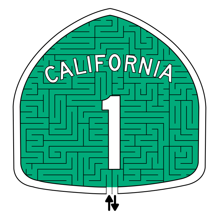
Route 1 Sign Maze
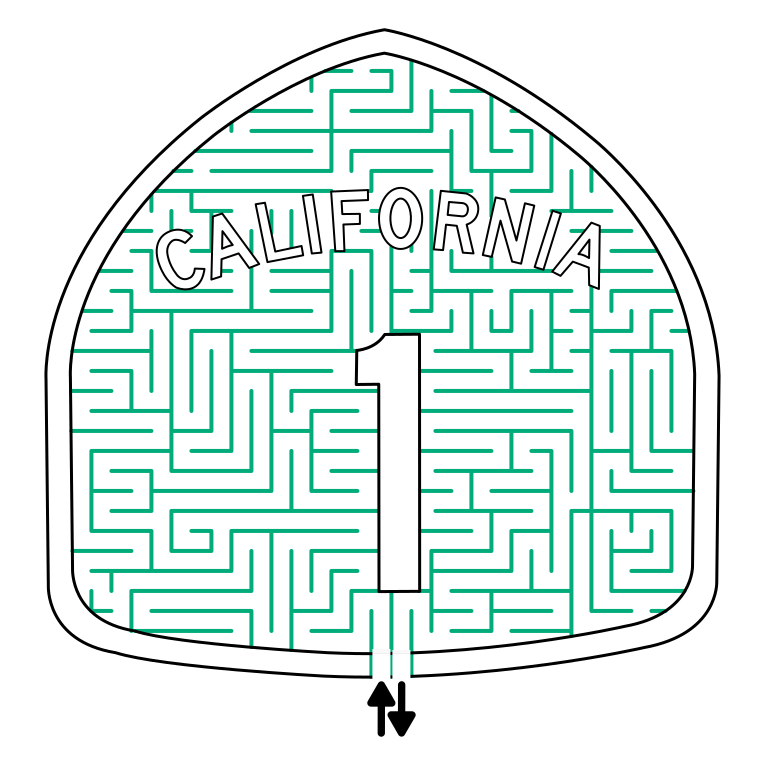
Maze Design 2 - Pathways colored as is
For our second example we simply lose the background color and change the pathway color to the former background color. The maze sign is recognizable, but the color is very subtle but visible. For some designers this would be an acceptable solution. In this instance I would want this maze to have a bit more color….so

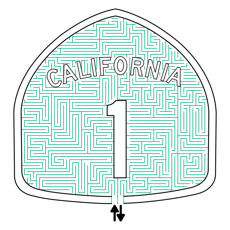
Maze Design 3 - Pathways colored, but twice as thick
So I took the maze above and doubled the thickness of the lines to increase the appearance of the color in the background. It definitely works to achieve more color. And, depending on how you feel about the maze you have designed this might be a great solution. But there are 2 more options, best these options should be decided on before you have started mazing.
Maze Design 4 - Twice the pathways, original thickness
This option will make for a maze that is twice as long (or at least has twice as many pathways). For the example I cut the original maze in half (not recommended) to quickly construct it. The result is a darker background, a more difficult maze, and a longer design and drawing process. This is a nice option if you want to increase difficulty. There is certainly enough space to make this complicated ! We do have 1 more option to look at…
Maze Design 5 - Twice the pathways, double thickness
To bring the options full circle I took Maze design 4 and doubled the thickness of the pathways as I had before in Maze Design 3. The width almost switches this maze from a standard maze construction to a standard equal maze construction. Lots of color in this one.

So those are 4 possible designs for the same maze, with 4 different colored pathway options. I wanted to illustrate that the use of color is about more than color you assign the path, but also about their spacing and their thickness. Any could be used depending on how you want the final maze to look and the difficulty you want to give the solver. Here is a comparison of all 4 colored pathway examples together so you can more easily compare them. Which do you prefer ?

Let’s look at some additional maze art I have made where I used non-black lines and talk about why. These are more about keeping the integrity of the illustration than coloring it, but it is a similar story.
First we have my Mount Rushmore Maze. I really enjoyed making this one. The president’s are carved into the side of the mountain and using black made them to defined IMO. The grey lines look more natural, as if the carvings are part of the structure (which they are!).

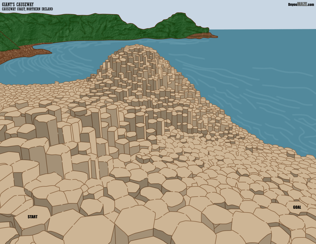
My second example is the Giant Causeway Maze. Maybe we have a theme, because once again I used the color brown to draw the basalt columns, as black contrasted too much with the illustration. So in these first 2 examples I wanted the nature scenes to look natural. Using black in either would make them look too bold/unnatural.
My third example comes from my maze of the Gibraltar Lighthouse. Same idea, but a bit different. The lighthouse is made of stones. I used black for the outer walls, but all internal walls or mortar was a more natural grey.

My last example is more in line with the California street sign above. I made a red barn maze in 2 different variations. I prefer the colored red vs the red lines, but you may disagree. For some applications you may want one over the other. You have the option.

